Given the identifiable constraints, static Figma frames at handoff weren't going to be enough
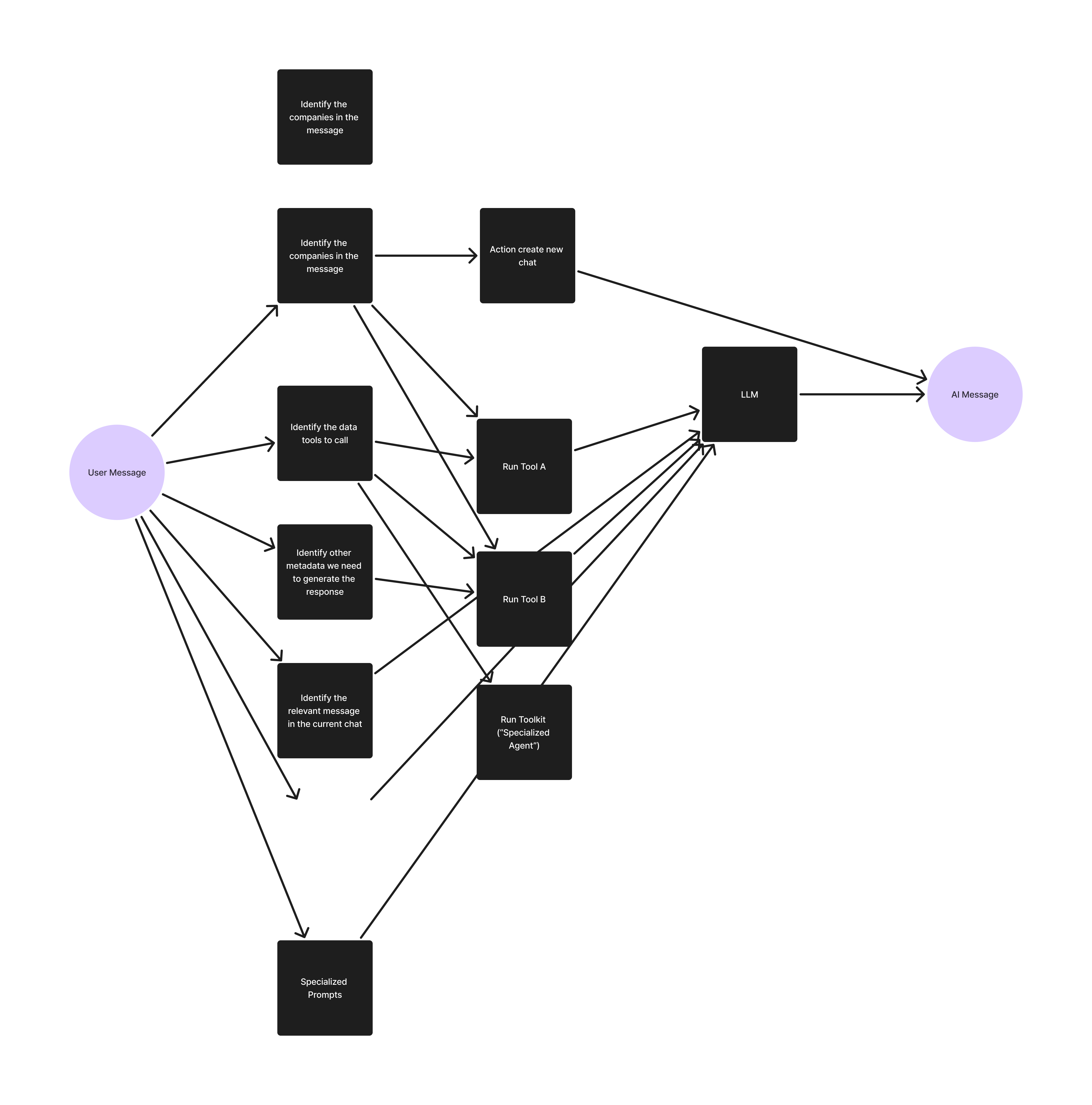
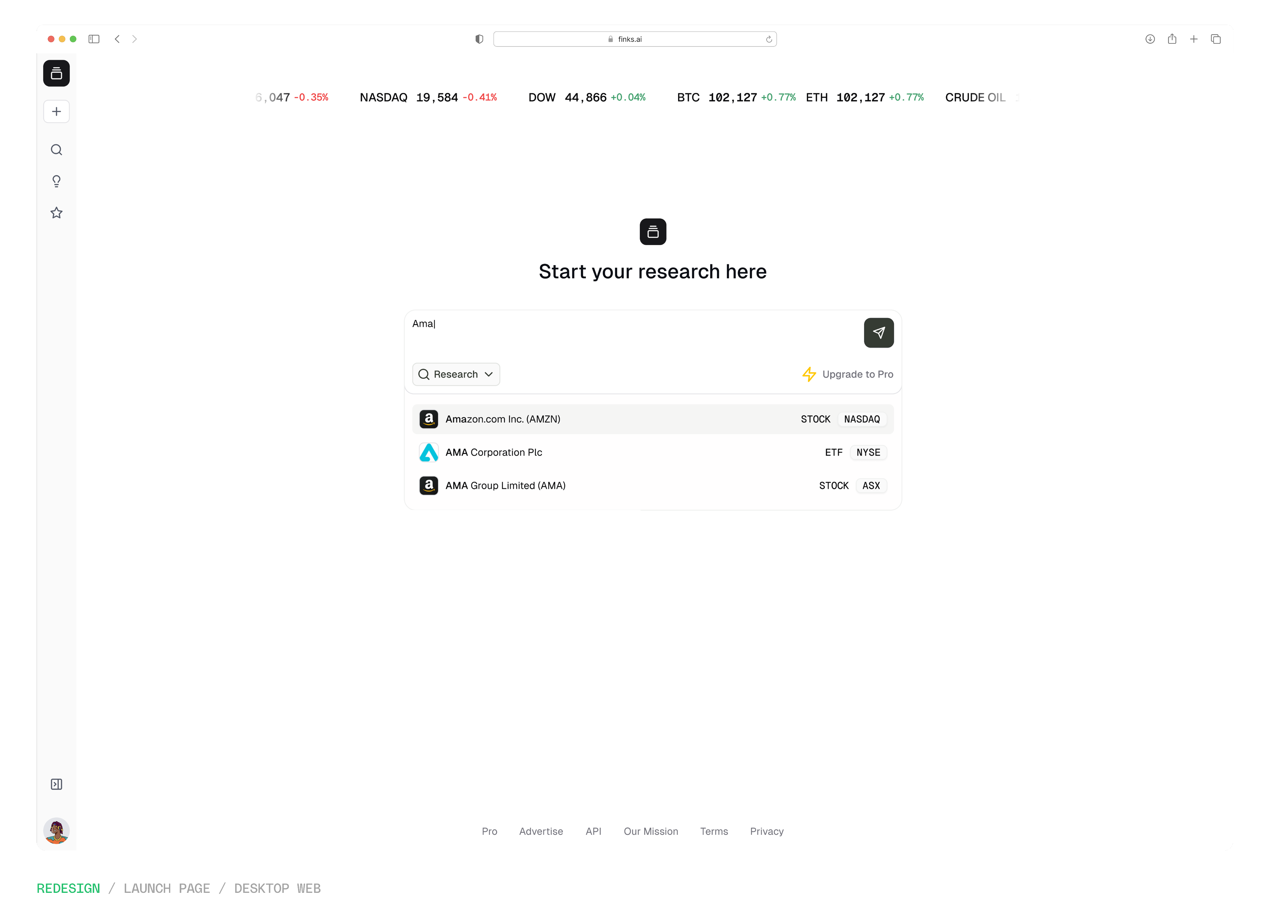
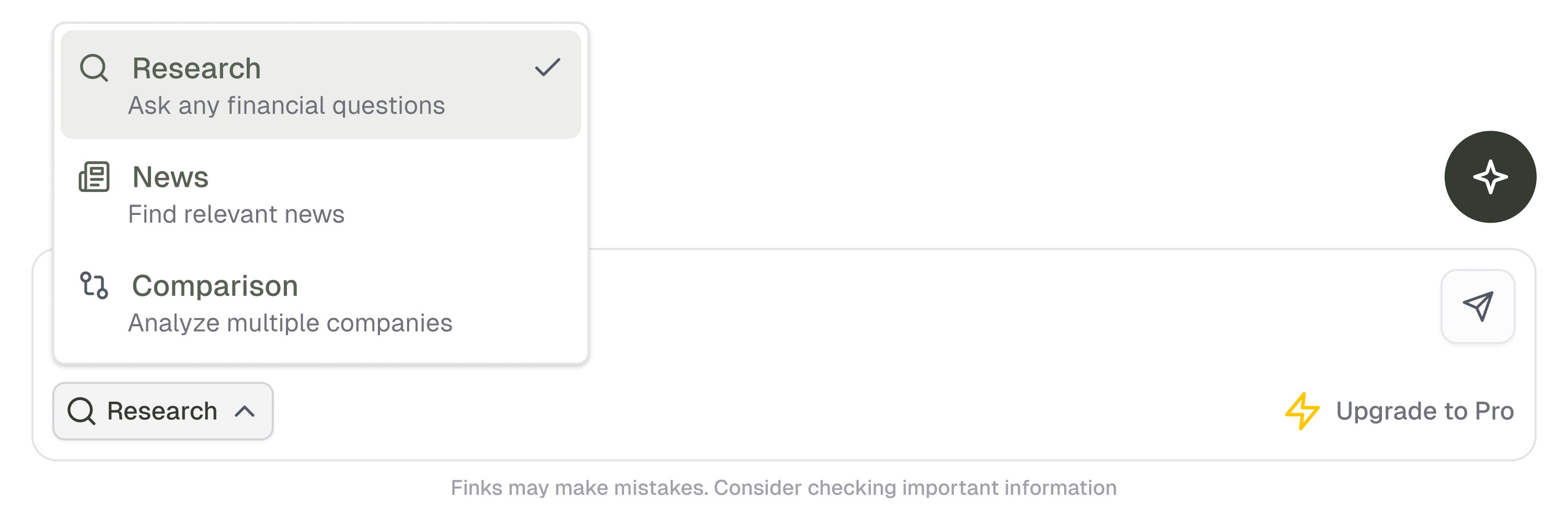
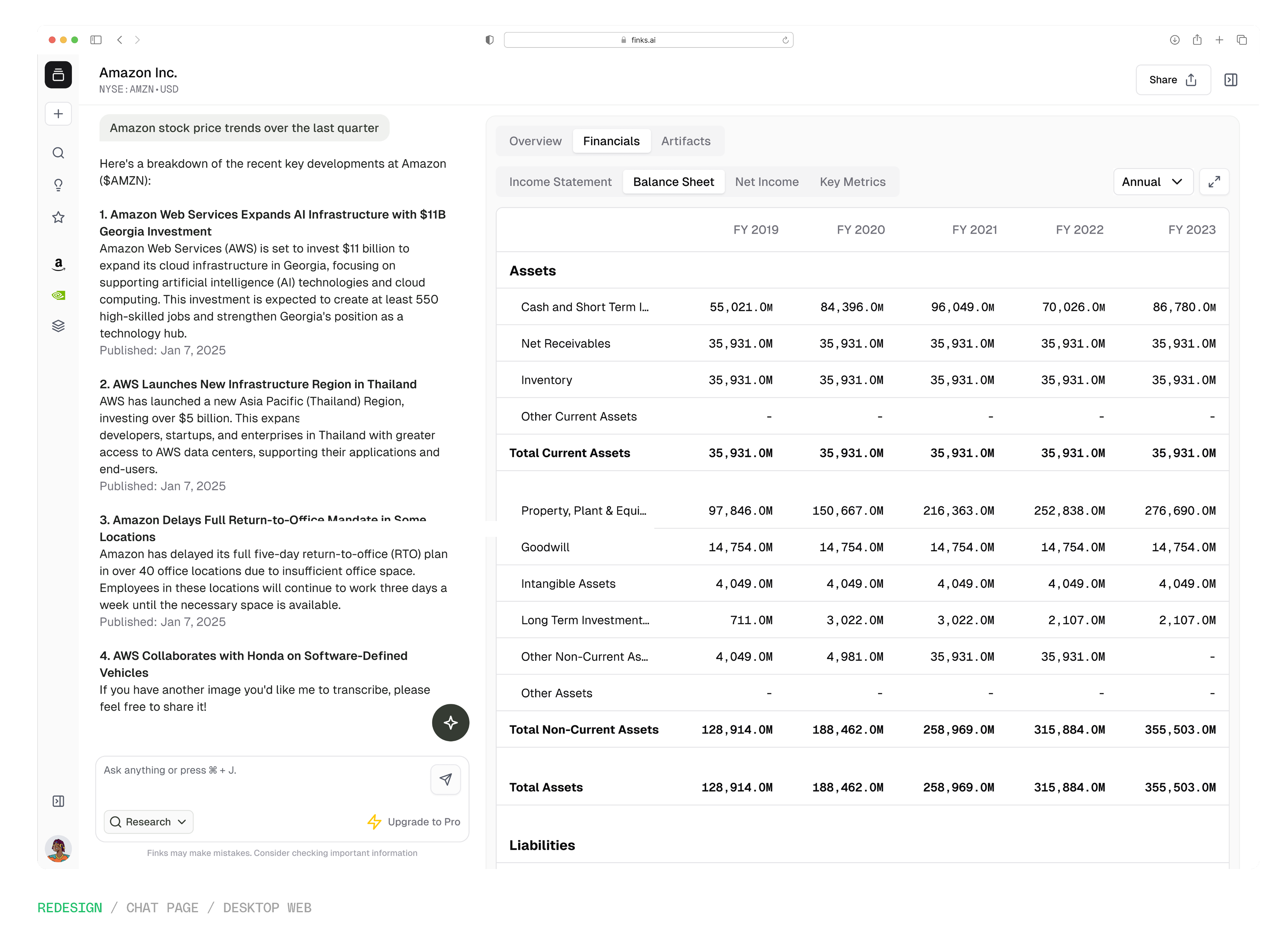
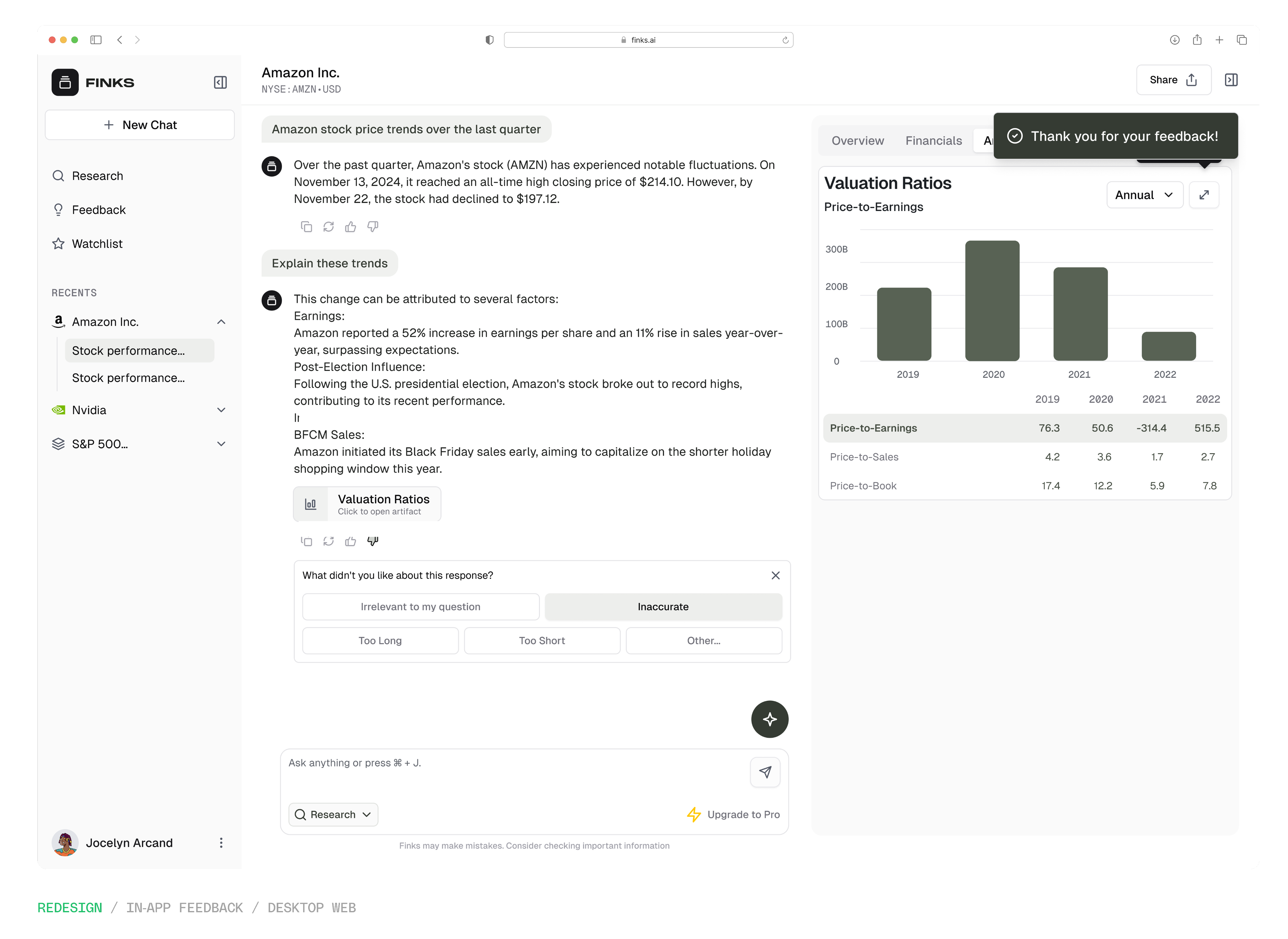
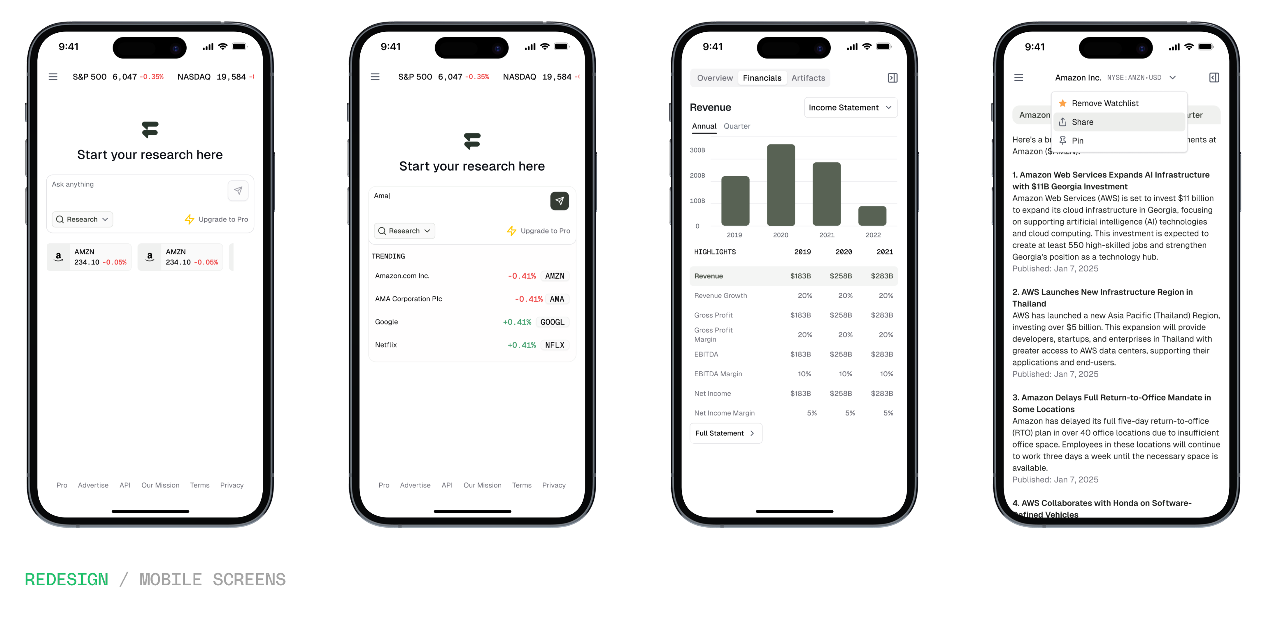
For straightforward, basic response views, standard UI layouts. Figma was fine. But for the interactions that were hard to communicate design intent eg. how the artefacts section worked, how the charts and tables responded to user input, how the interface assembled itself around an AI response, I needed something closer to the real thing.
I used Figma's MCP integration alongside Cursor to build prototypes directly from the designs. My workflow was well thought out and deliberate: brainstorm the interactions, bring it into Cursor, and build a working clickable prototype that engineering could reference, during implementation or design reviews.
It was about bridging the gap between design intent and implementation not writing production ready code, especially for a team that couldn't address ambiguity in real time. The prototypes focused on the interactions that mattered most: the artefacts section where I used progressive disclosure patterns, the chart and table behaviours, the transitions that communicated how the interface should feel in use, and more.
The outcome was better than the typical handoff. Some of the code the those prototypes was reviewed and merged into the main branch as-is. It was amazing to know that what I built to communicate the experience became part of the product.