Improving design & development efficiency with a design system

Improving design & development efficiency with a design system

Starting out as the first design hire on a team that isn't design-led means you have to justify everything, and that includes the design system. The resistance usually comes down to two things: prioritising it over "more important" feature work and proving the immediate ROI. My approach is always to use my user-centred mindset to frame the long-term costs: without a system or a solid foundation, the user experience, collaboration, efficiency, scalability, and time-to-market suffers.

Role

Product Designer

Responsibilities

Design System

Timeline

Q1 2024

Team

Dami / Product Designer

I collaborated closely with the team contracted to define the new product's look and feel. This partnership allowed for an easy collaboration of visions and ideas, defining everything from who the product would serve to its long-term growth trajectory and UX goals. This alignment was the perfect starting point for me to build a comprehensive set of guidelines and components. These now serve as the single source of truth at Mercurie (and AdPay), ensuring a consistent and scalable user interface across the platform for both design and development.

Starting Point

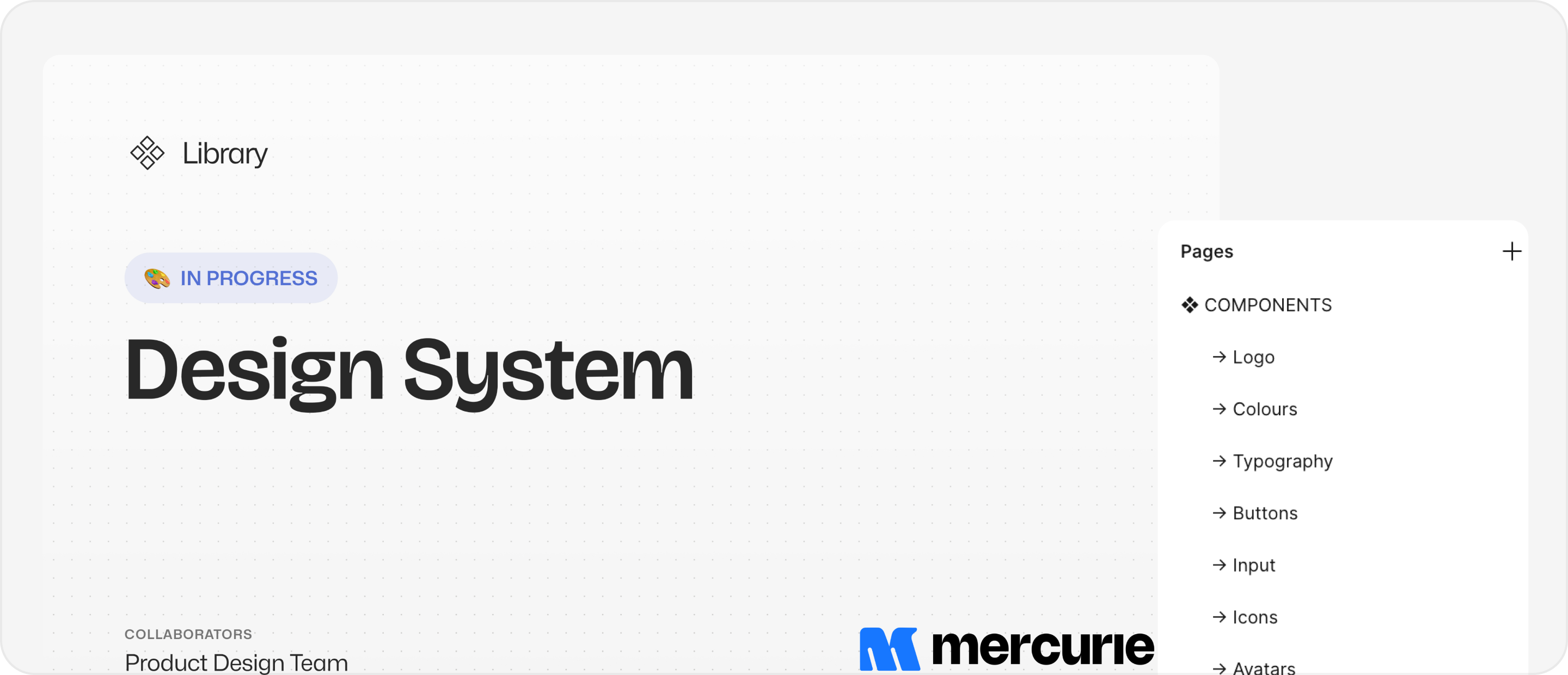
I began by analysing 40+ design systems built in Figma (via the Figma Community). This allowed me to study and extract common patterns for things like text styles, spacing, and colours.

Why this approach? Before this project, I had only created style guides/UI kits, not a ‘standard’ design system. It was important for this project and my own personal growth, to get familiar the industry's best practices before tackling this. Studying these systems gave me key insights into organisation, naming conventions, scales, how to successfully apply these rules for responsive designs and more.

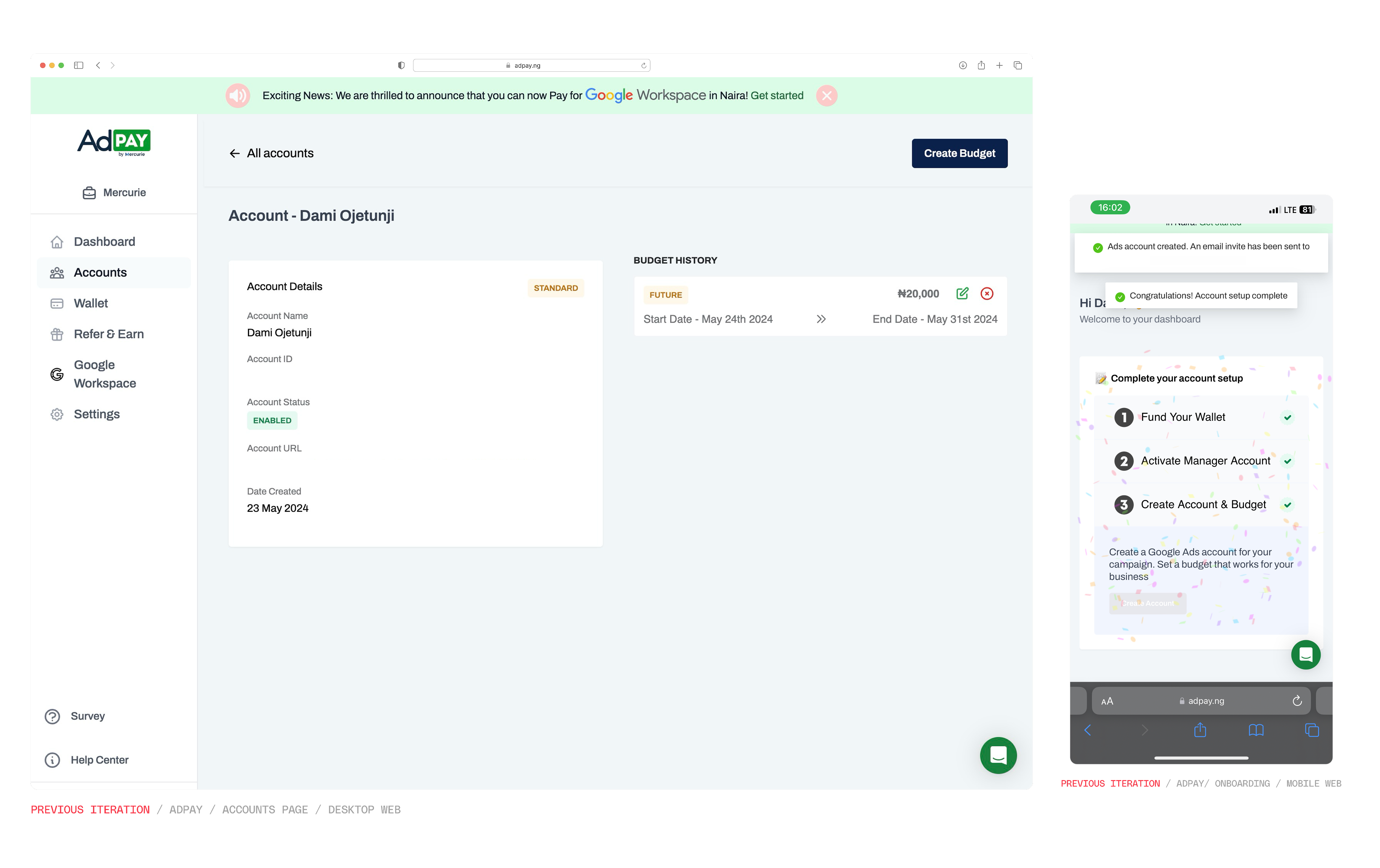
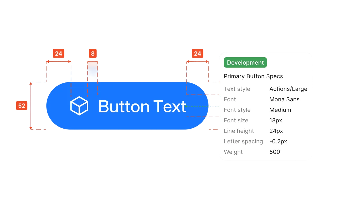
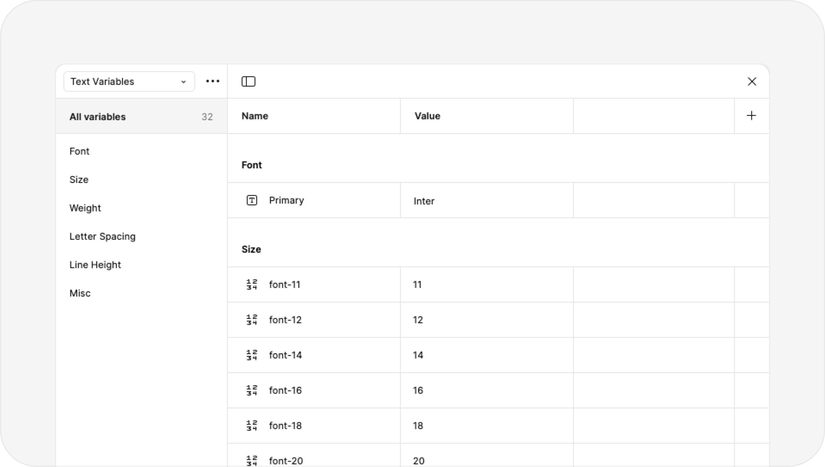
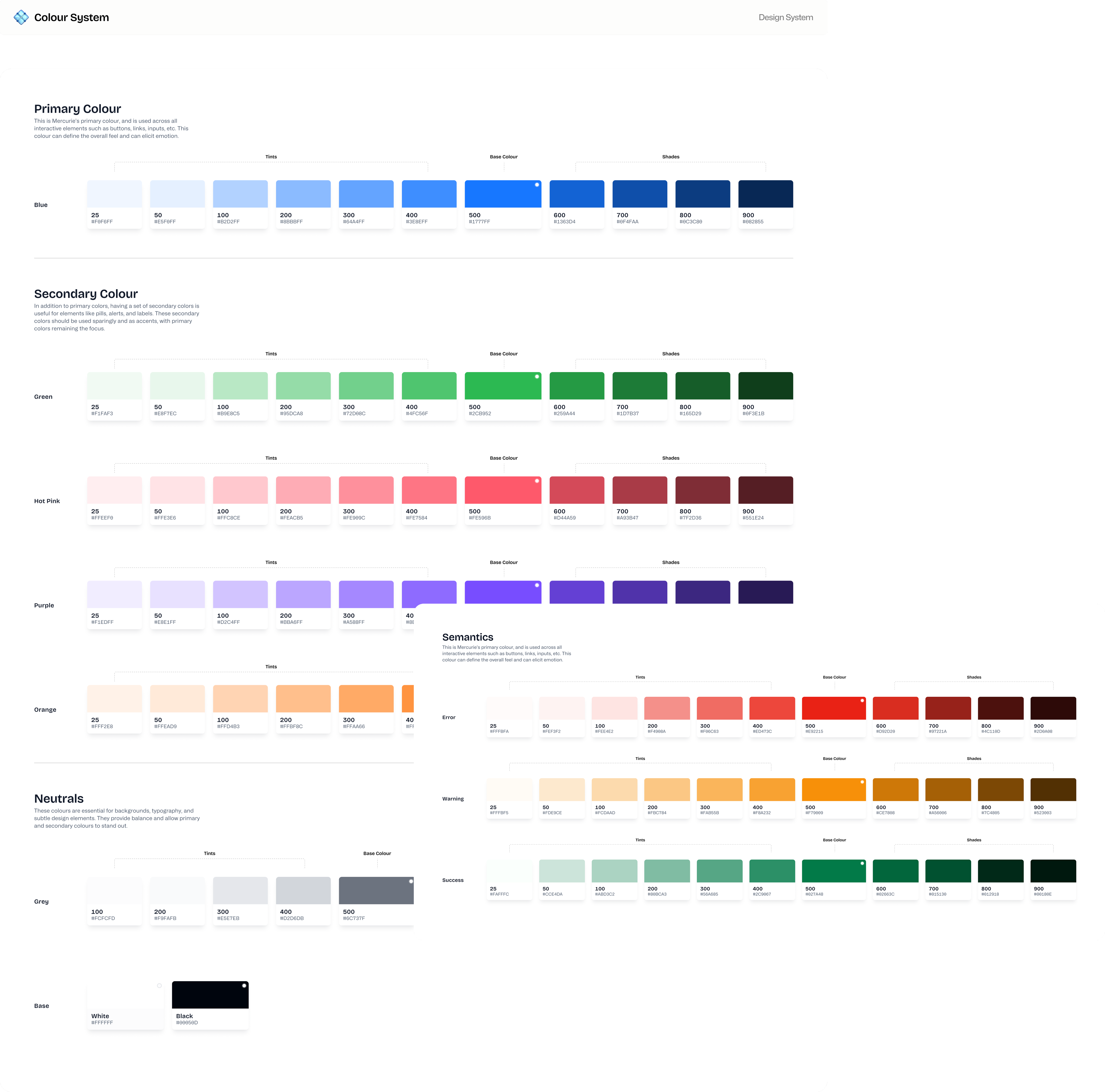
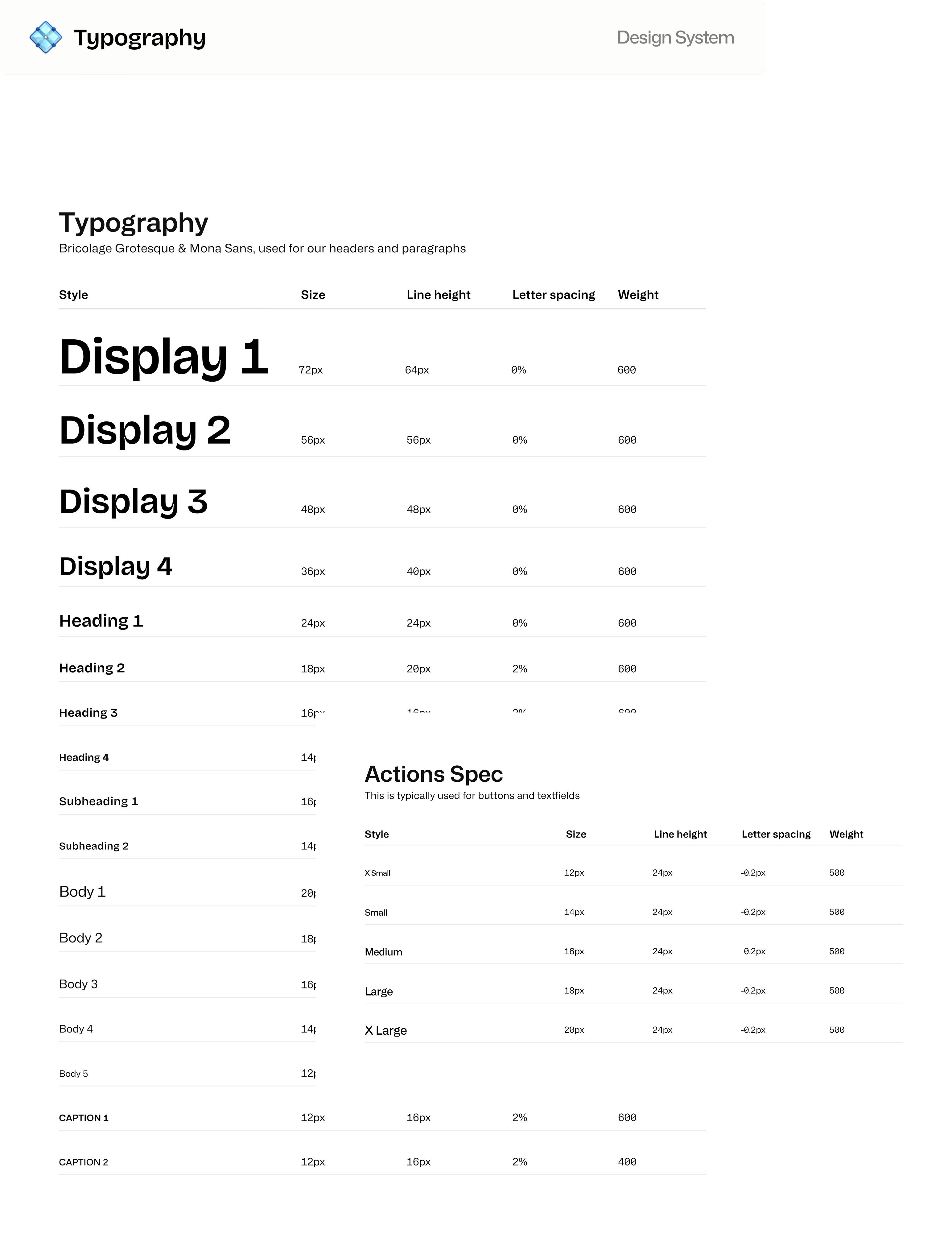
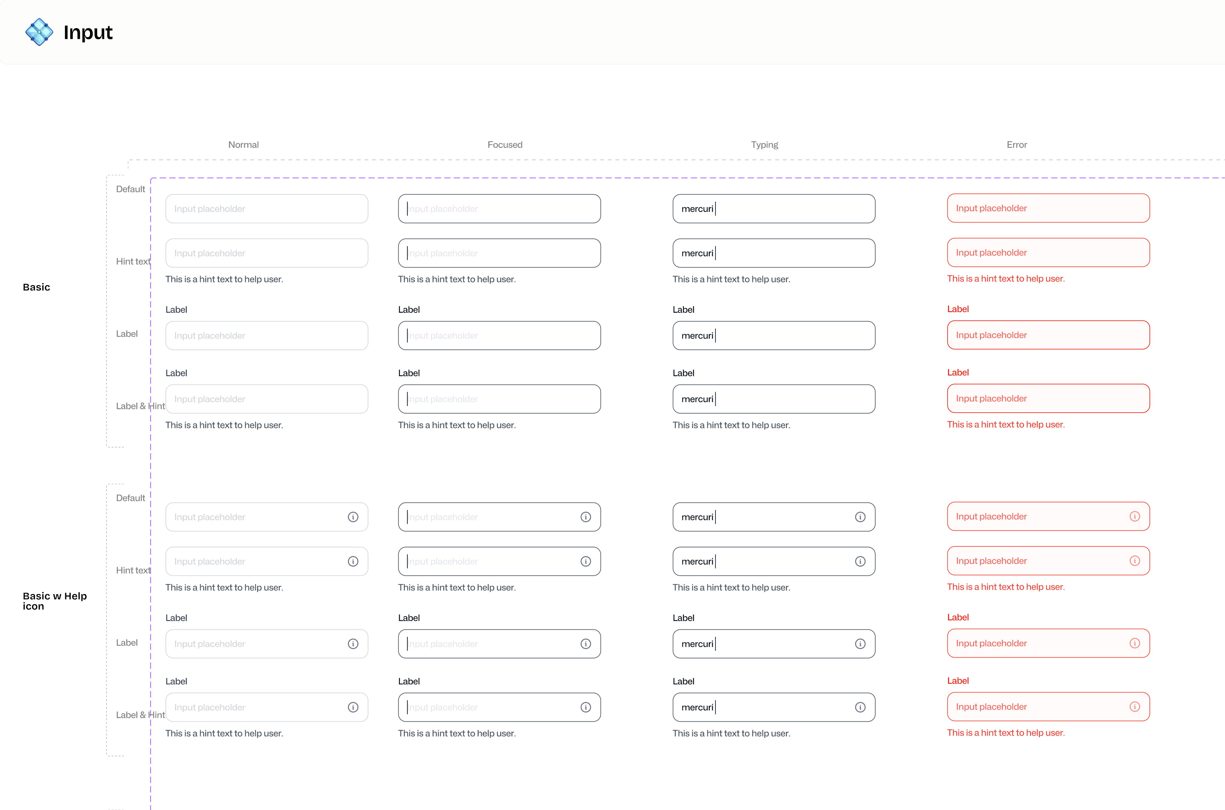
(Bear in mind) I was simultaneously building this while working on the platform's early iterations. I think this approach really helped me test and get earlier previews on what worked and didn’t for the interface. A good example of this was A/B testing input fields and button types while analysing the onboarding process with the team. Basic foundational visual aspects were defined in the branding, like the logo, typeface and colour system. Where I came in was defining the line height, naming conventions, variables, states, semantics and other details.

Atoms, Molecules, and the Rest

During my research, I loved the way Design Systems use the Atomic Design methodology. I broke the Mercurie system down to the smallest parts (Atoms like buttons and fields) and then built them up into reusable components (Molecules and Organisms). This helped me truly understand how the design system moves beyond basic building blocks and works as one whole, that's the best part of good design. Atomic design gave me the structure we needed. It was also important that components had to be reusable across Mercurie AND our sister platform, AdPay.

Conceptualising

I focused on building flexibility into the foundation partly to ensure that the library continues to grow and evolve as we scale. Also because, every component needed to handle multiple states, adapt to different contexts, and work seamlessly across Mercurie and the sister platform, AdPay. This meant thinking beyond just visual consistency and aesthetics, I had to consider accessibility standards, scalability, responsiveness, and how the engineering team would implement these components.

The key was starting with the constraints. By defining spacing scales, variables, colour tokens, and typography systems first, I created guardrails that made design decisions faster and implementation more predictable.

I redesigned the Adpay platform primarily to solve reoccurring pain-points across onboarding, payment, referral flows, and improving user experience for active users before moving them to the Mercurie platform. This also meant updating the UI but retaining the branding but, with new components
Used variables for components like typography, colours, spacing, annotations, and more to create a system with robust naming conventions to ensure team alignment and production-ready components

Impact

The system has successfully become the single source of truth, fully aligning design and development. Engineers now build and iterate much faster using documented components, and I can move quickly knowing that common patterns are already solved. Because of the cross-platform requirement, the AdPay platform benefited immediately from every component built, it's a perfect flow state.

The design system has also grown significantly since I first built it in Q1 2024. The addition of new platform features like wallets, virtual accounts, and compliance required specific components, pushing us from about 960 components to over 2,100. It's certainly robust! 😄

More importantly, the system fundamentally shifted how the team approached product work. The long-term ROI I'd argued for at the start became genuinely tangible: faster feature development, fewer visual inconsistencies, and a scalable, dependable foundation.

One System, Two Platforms

Using the new design system to update AdPay's UI required a balance. While the component library gave us consistency and efficiency, I couldn't simply copy and paste Mercurie's visual language. AdPay had existing users who'd built muscle memory around the existing interface; a dramatic visual change would create unnecessary friction and risk increasing existing drop-offs. So, I adapted the system to suit AdPay's layout patterns and colour palette to feel familiar to the users but better while solving recurring pain points across onboarding, payment, account, and referral flows.

My goal for AdPay was to improve the UX for active users before eventually transitioning them to a unified platform.

The sister platform requirement initially felt like added complexity, but it actually helped me focus on designing for real reusability and scalability. This led to components that are truly flexible and future-proof across different contexts, rather than being optimised for a single use case.

Reflections

Building a design system from scratch was a huge learning curve. It really drove home that the work is never truly "done", it just evolves alongside the product. The real skill isn't in creating perfect, finished components, it's in building a system that can change and grow without falling apart.

Starting the project by studying existing systems was absolutely the right call. I learned essential patterns I wouldn't have discovered on my own, which helped me avoid common mistakes. But what really kept me grounded was the simultaneous approach, building the design system while designing the product.

Ultimately, this project proved that design systems aren't just another designer lingo; they are critical infrastructure. Just like solid code architecture, a good design system makes everything you build on top of it better, faster, and much more maintainable.

👁️ For optimal viewing, please view this case study on a larger screen.